Power Run
Product branding and development
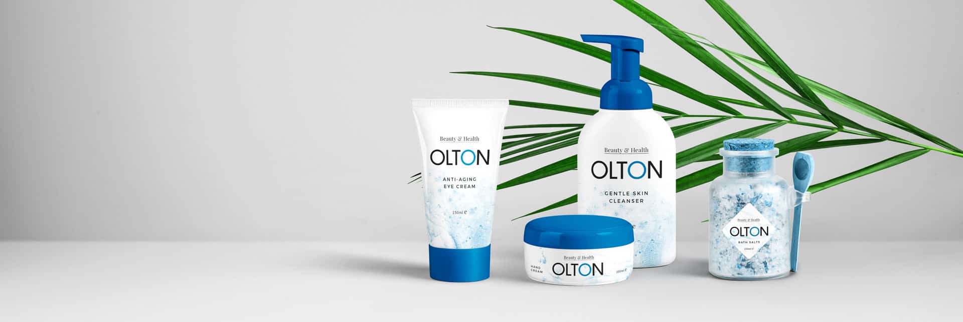
Understanding the audience allows us to develop visuals that reflect the intention of the product.
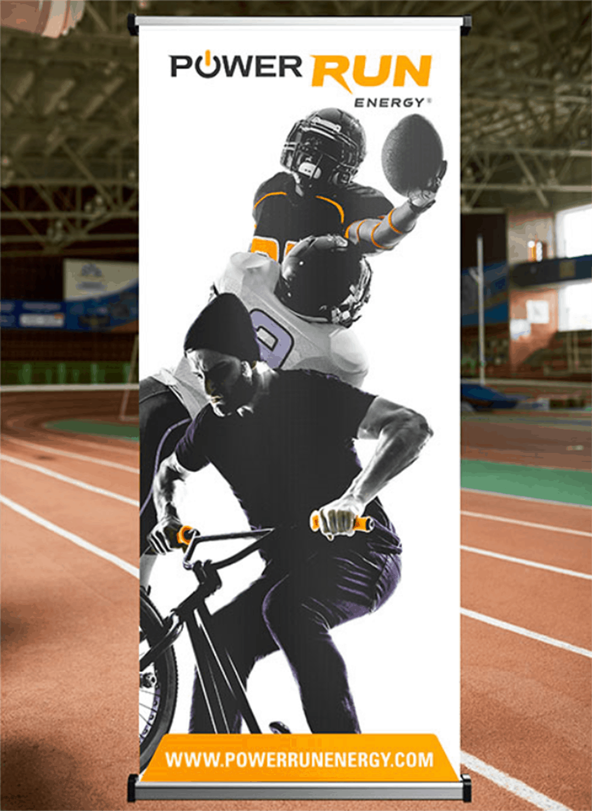
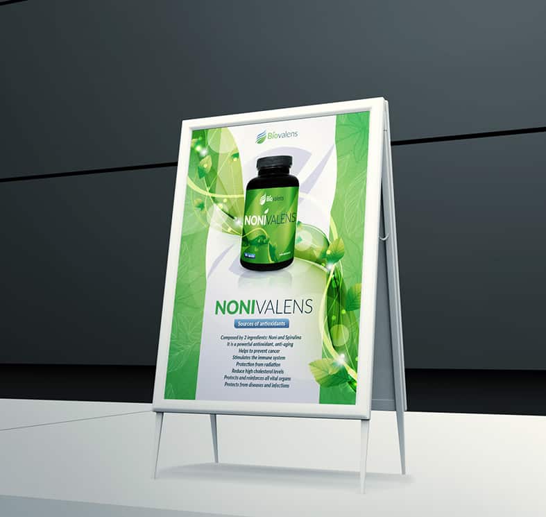
Banner Stand
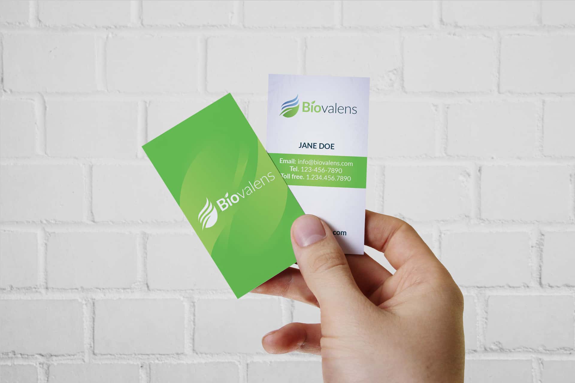
Keeping it simple was the rule and the request. Our client indicated that it was important to keep it very clean. This card was printed offset with mat lamination, delivered the thickness was 16pt.
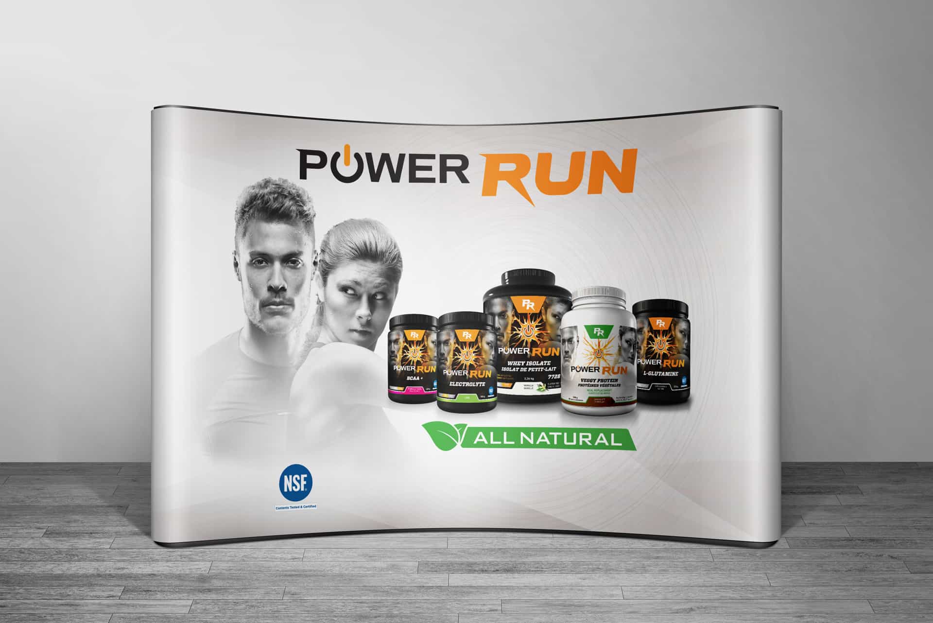
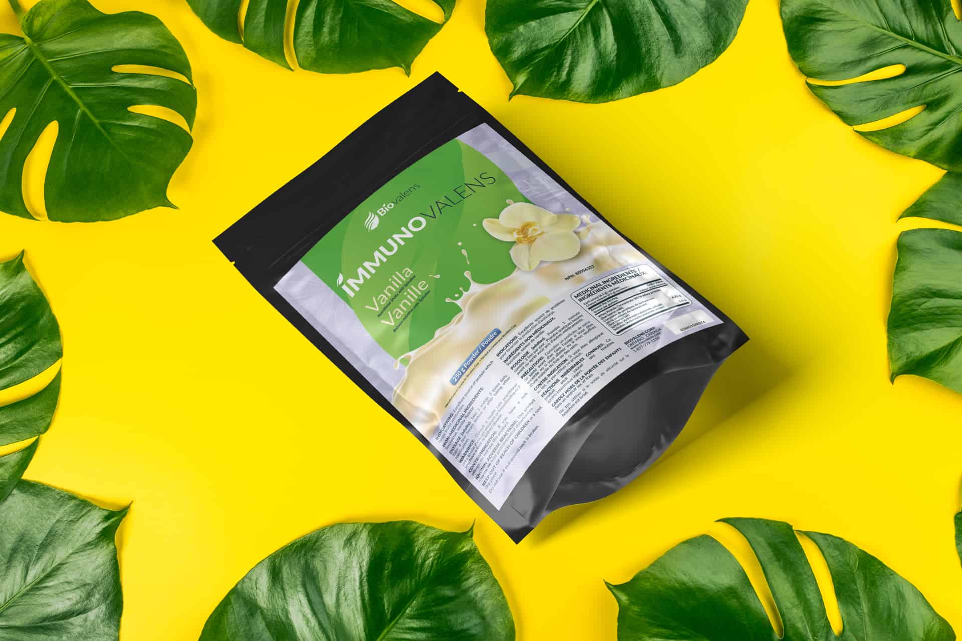
Product Presentation
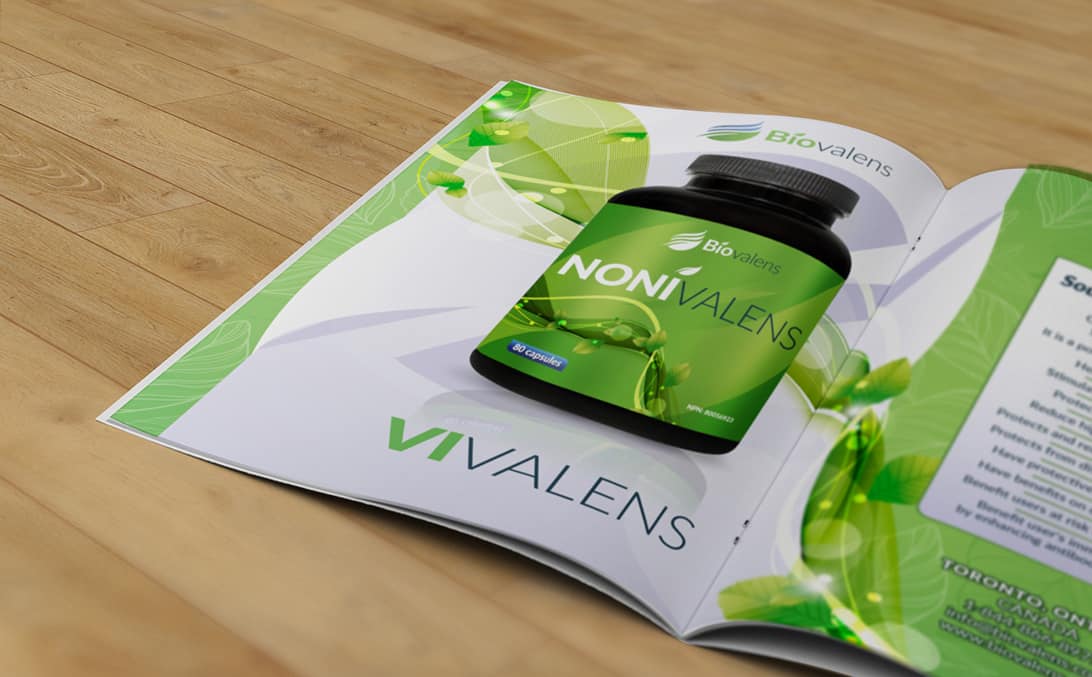
Our goal when designing this layout was to show one complete fluid design running across the spread.
We carried our label design in the background to indicate the natural values of the product.

Graphic Design
Our goal when designing this layout was to show one complete fluid design running across the spread.
We carried our label design in the background to indicate the natural values of the product.
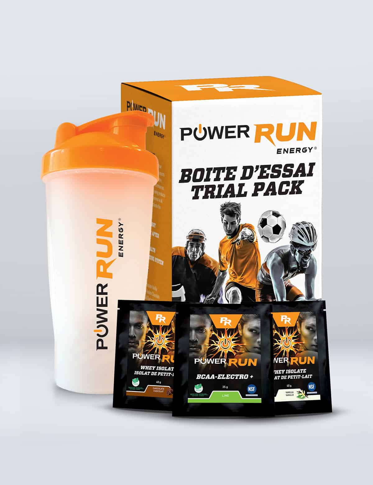
Product Presentation
Our goal when designing this layout was to show one complete fluid design running across the spread.
We carried our label design in the background to indicate the natural values of the product.
Product Presentation
Our goal when designing this layout was to show one complete fluid design running across the spread.
We carried our label design in the background to indicate the natural values of the product.
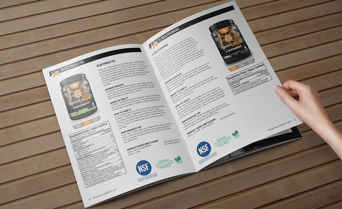
Brochure
Our goal when designing this layout was to show one complete fluid design running across the spread.
We carried our label design in the background to indicate the natural values of the product.
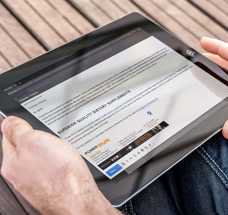
E-mail Signature
E-mail SIgnature set-up in your email makes your email more...
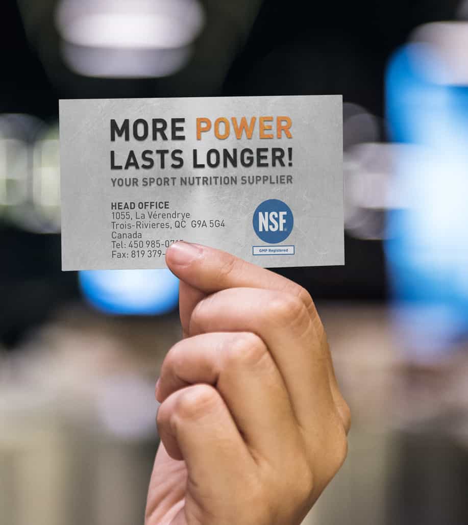
Business Card
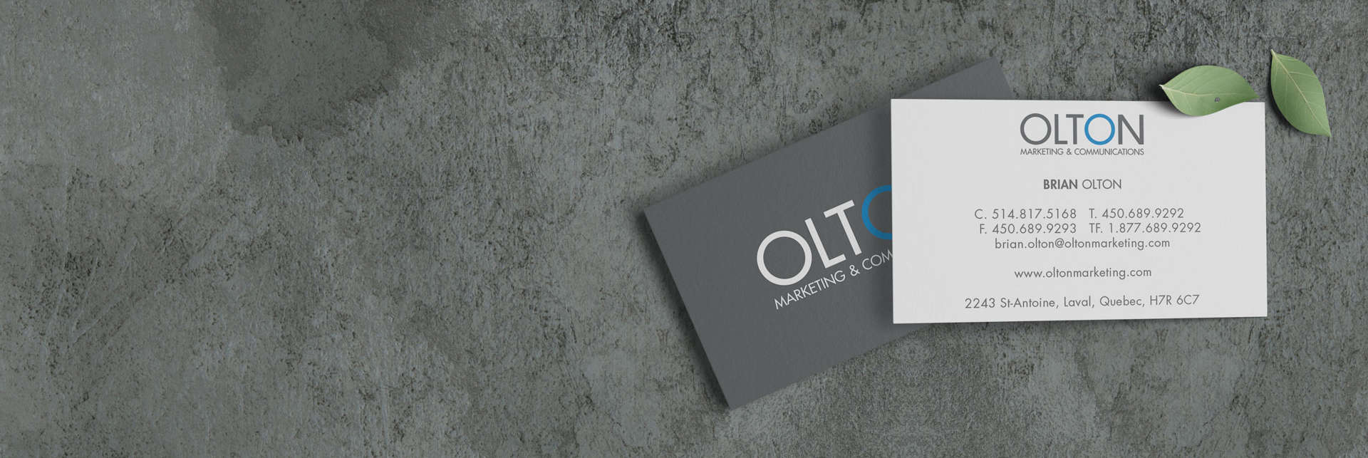
Keeping it simple was the rule and the request. Our client indicated that it was important to keep it very clean. This card was printed offset with mat lamination, delivered the thickness was 16pt.
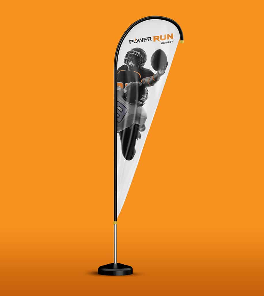
Customized Banner Stand
Keeping it simple was the rule and the request. Our client indicated that it was important to keep it very clean. This card was printed offset with mat lamination, delivered the thickness was 16pt.
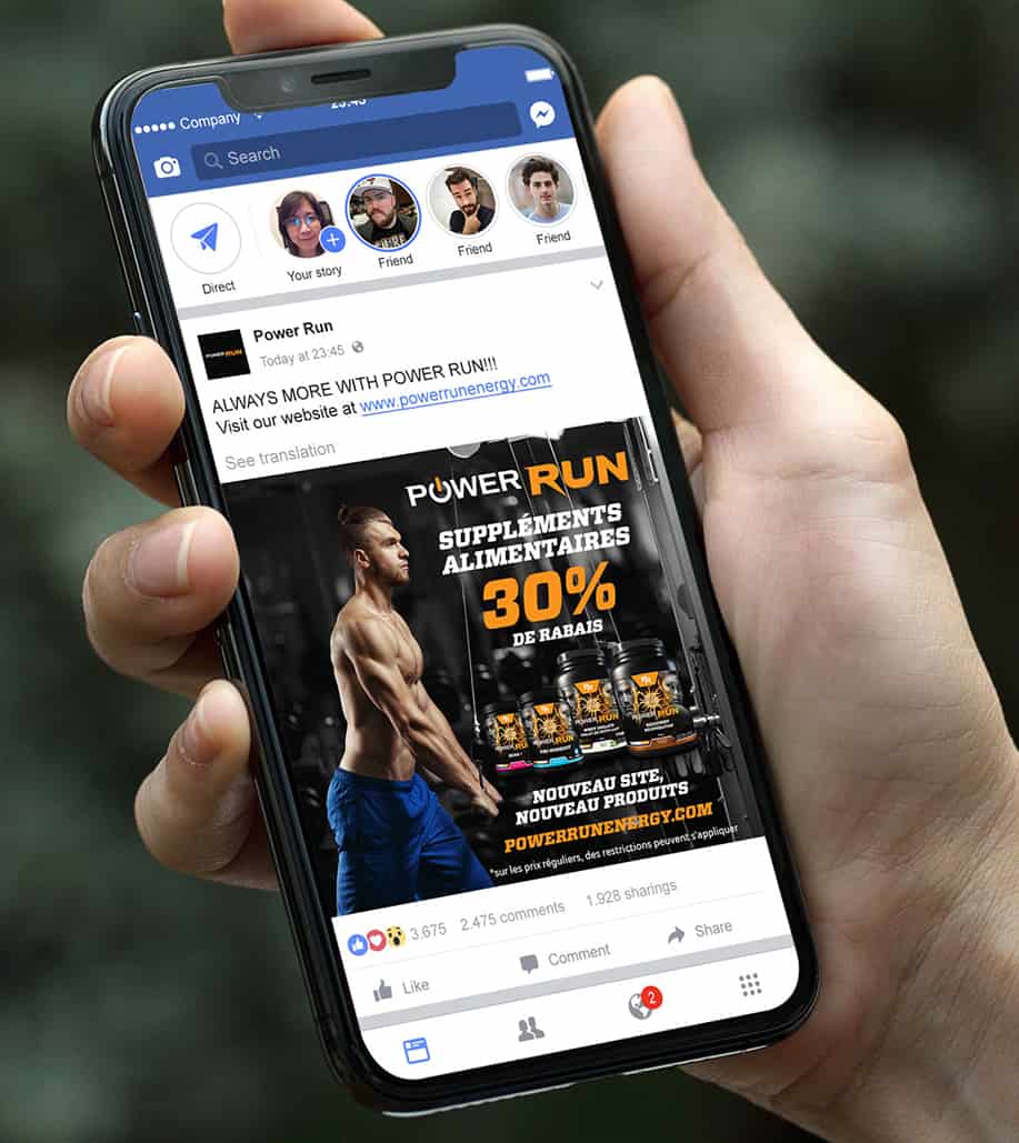
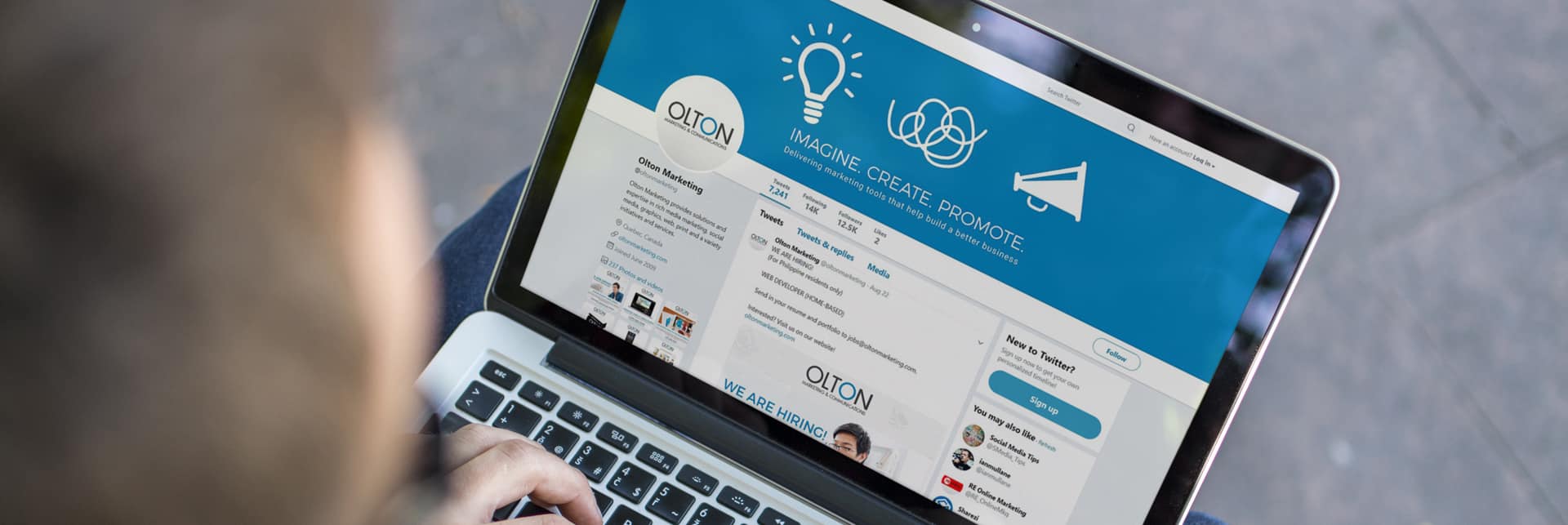
Social Media Management
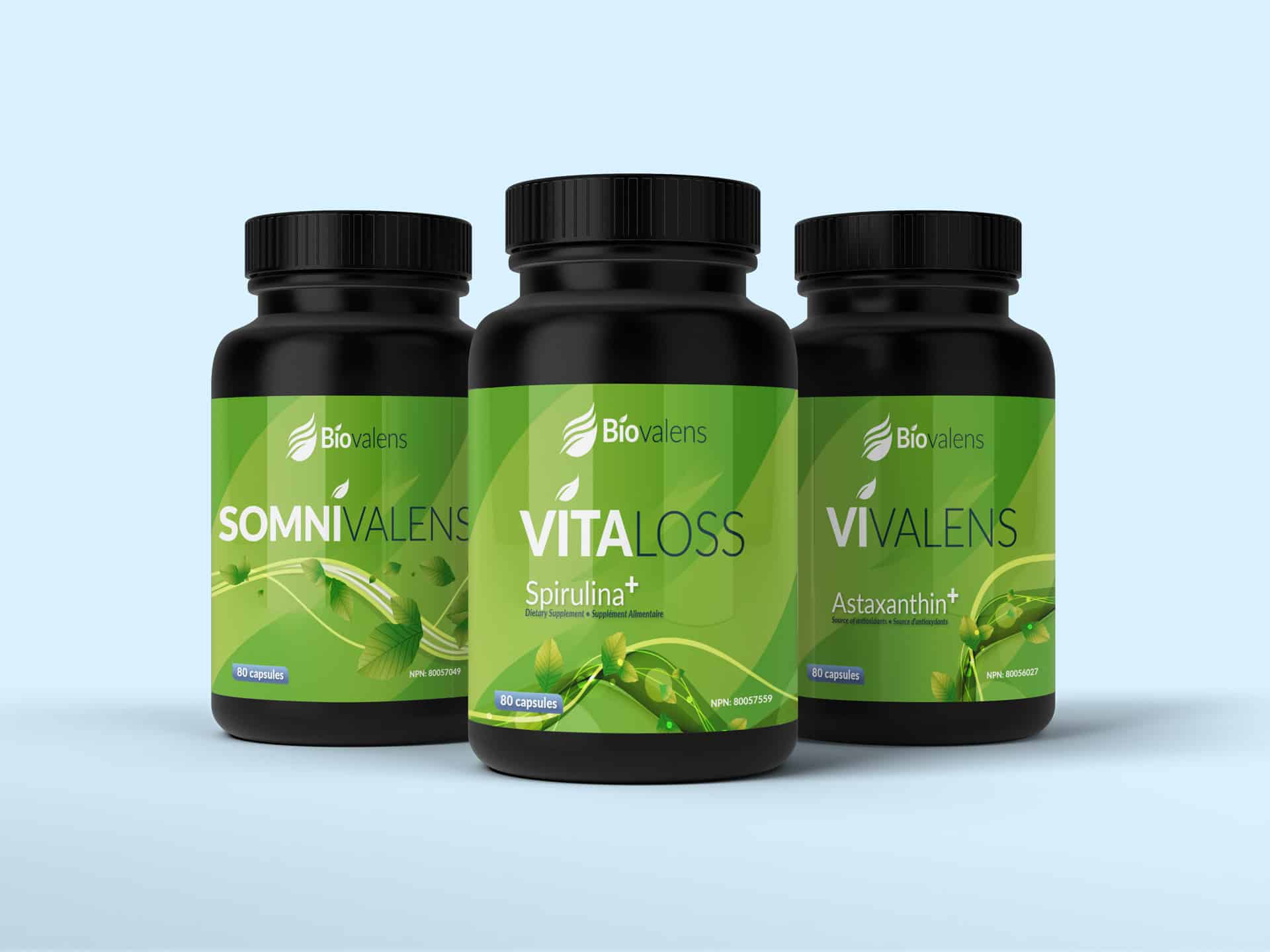
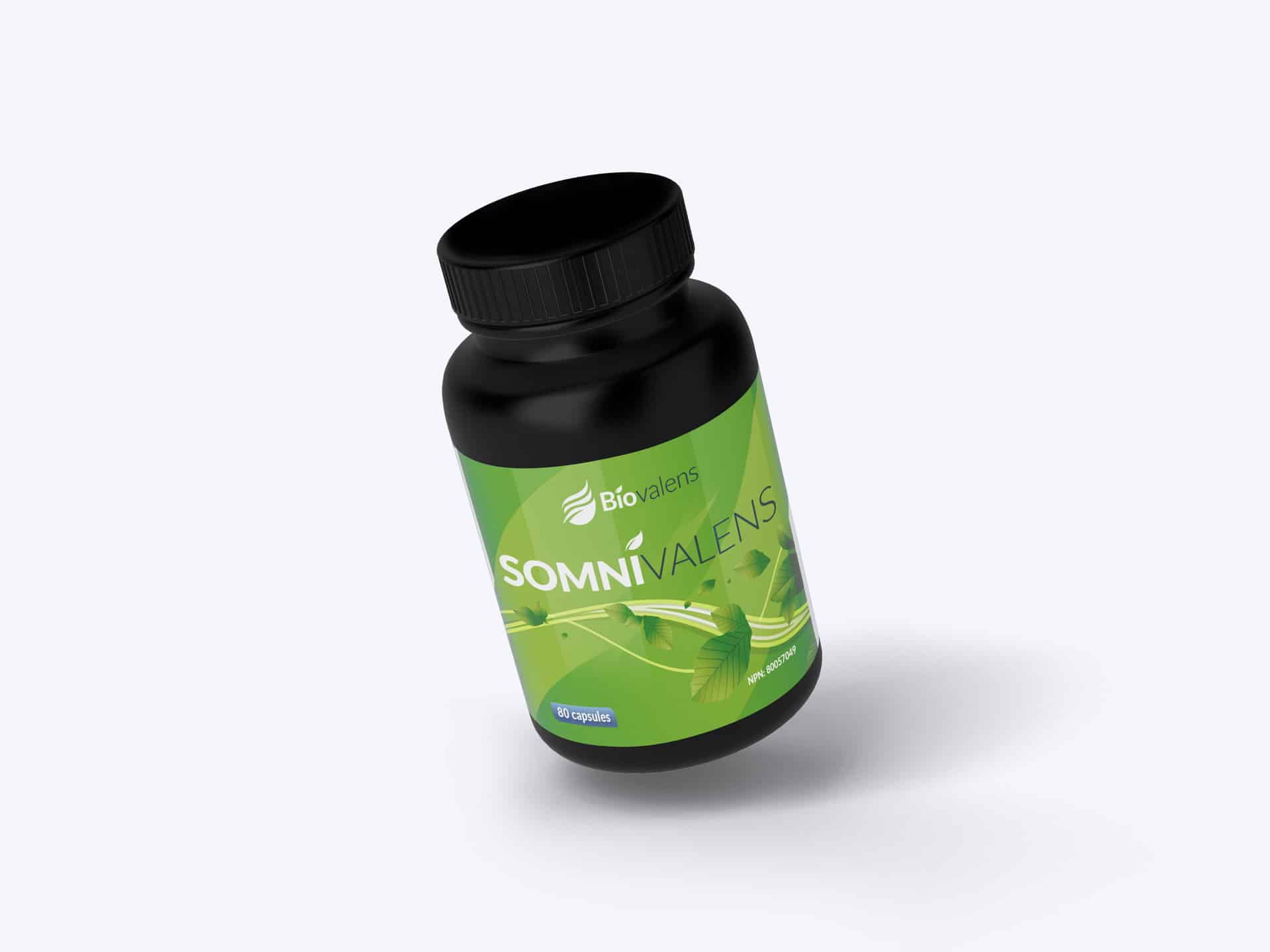
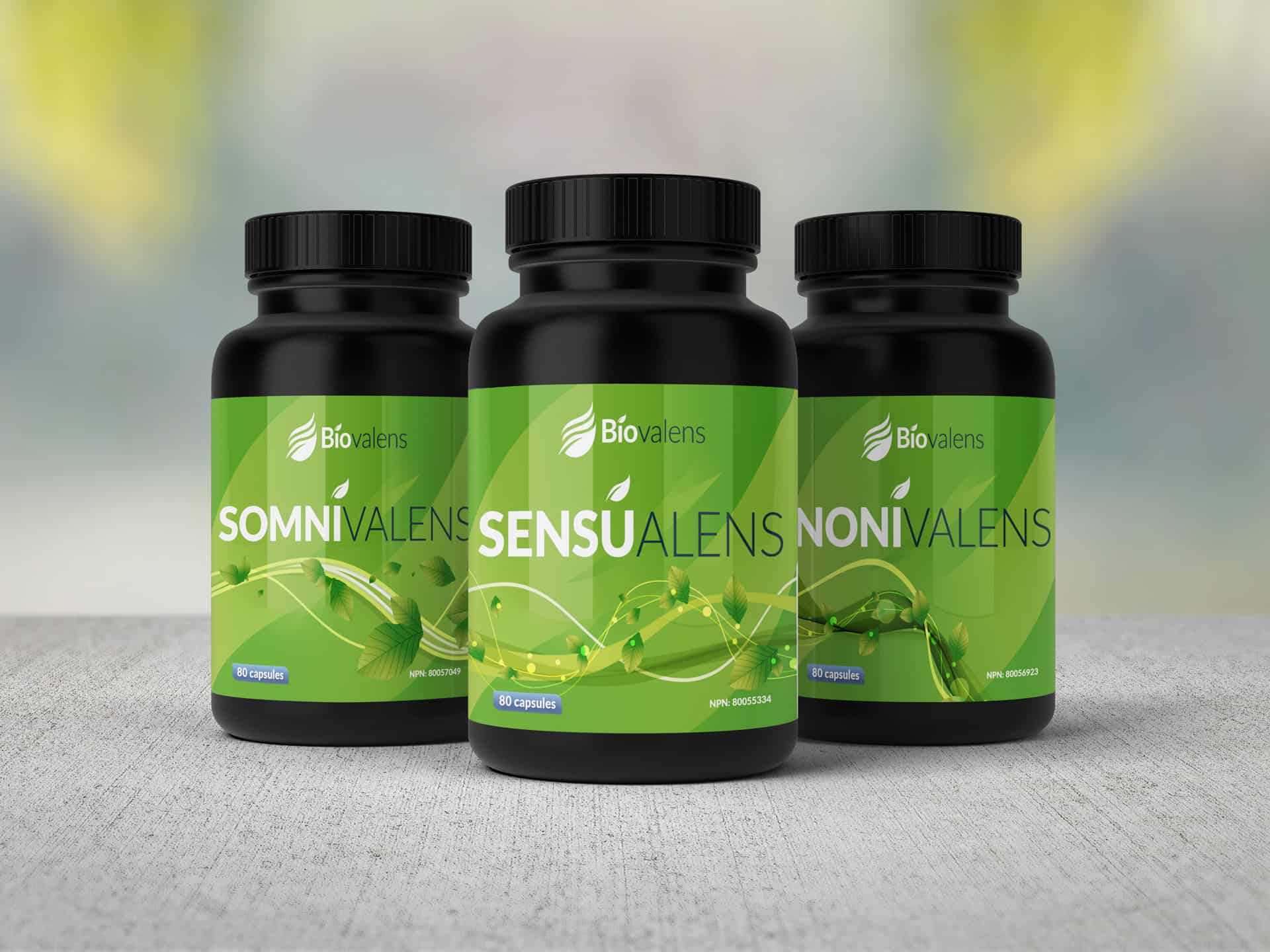
It was equally important to visualize the impact of the label/bottles using different backgrounds. Each label we created were married in theme that showed a natural fluent design, all different yet the same.
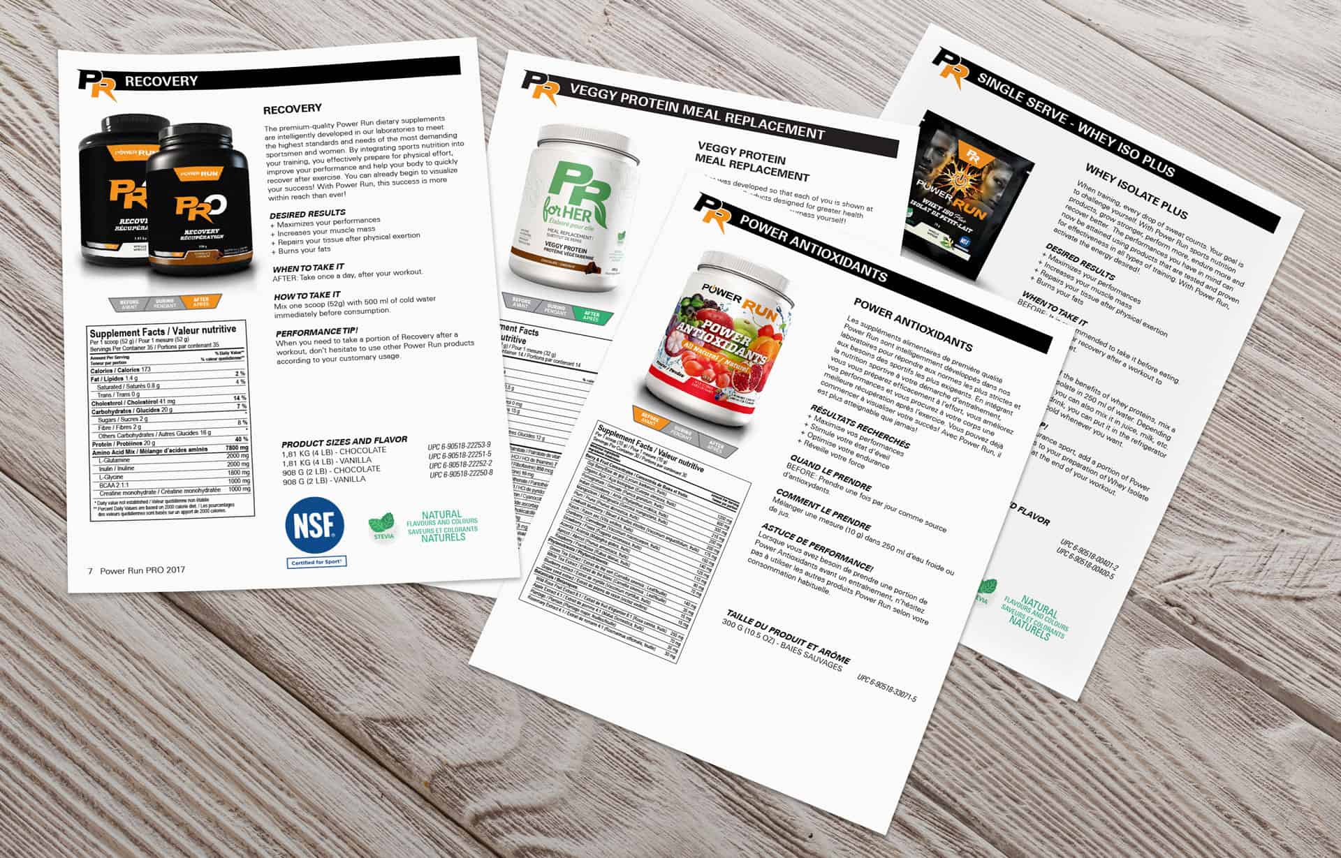
Product Sheets
These are also known as handouts, in this case, we saved our client a lot of money by not re-creating the design or the design size.Printing the sheets seperately had its benefits especially when it came to online ordering. The product sheet was packaged with the order, this way the client could have a clear representation of the product he or she was getting.
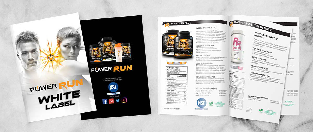
Brochure
Our goal when designing this layout was to show one complete fluid design running across the spread. We carried our label design in the background to indicate the natural values of the product.

